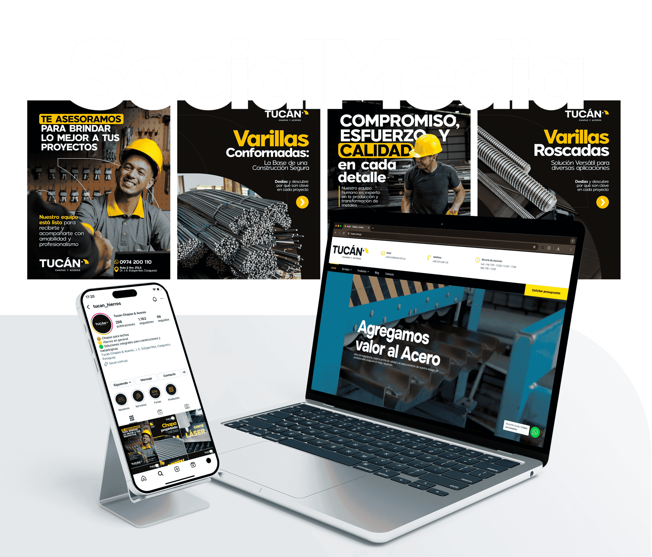
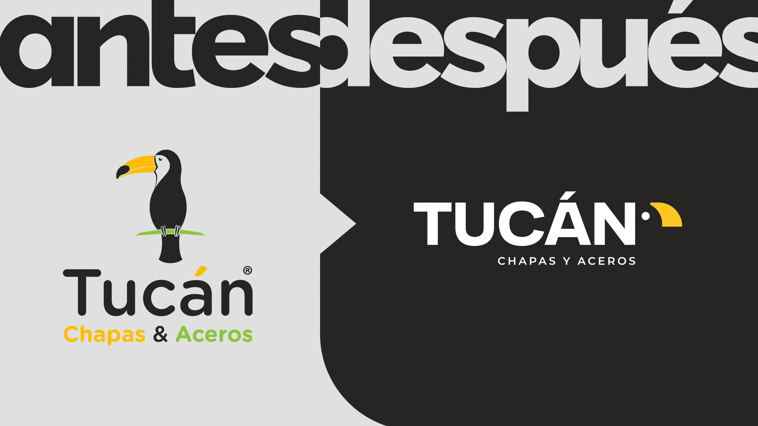
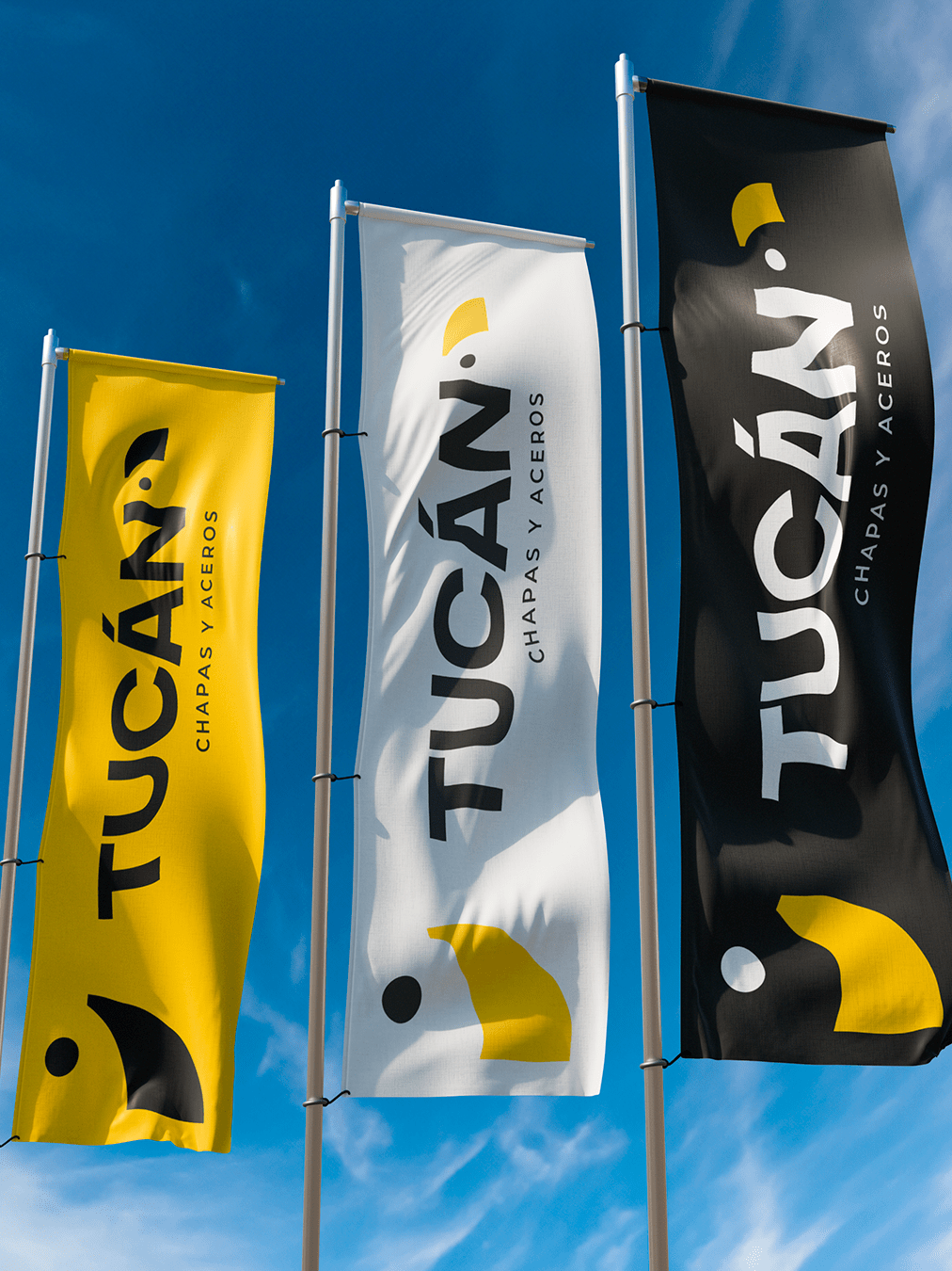
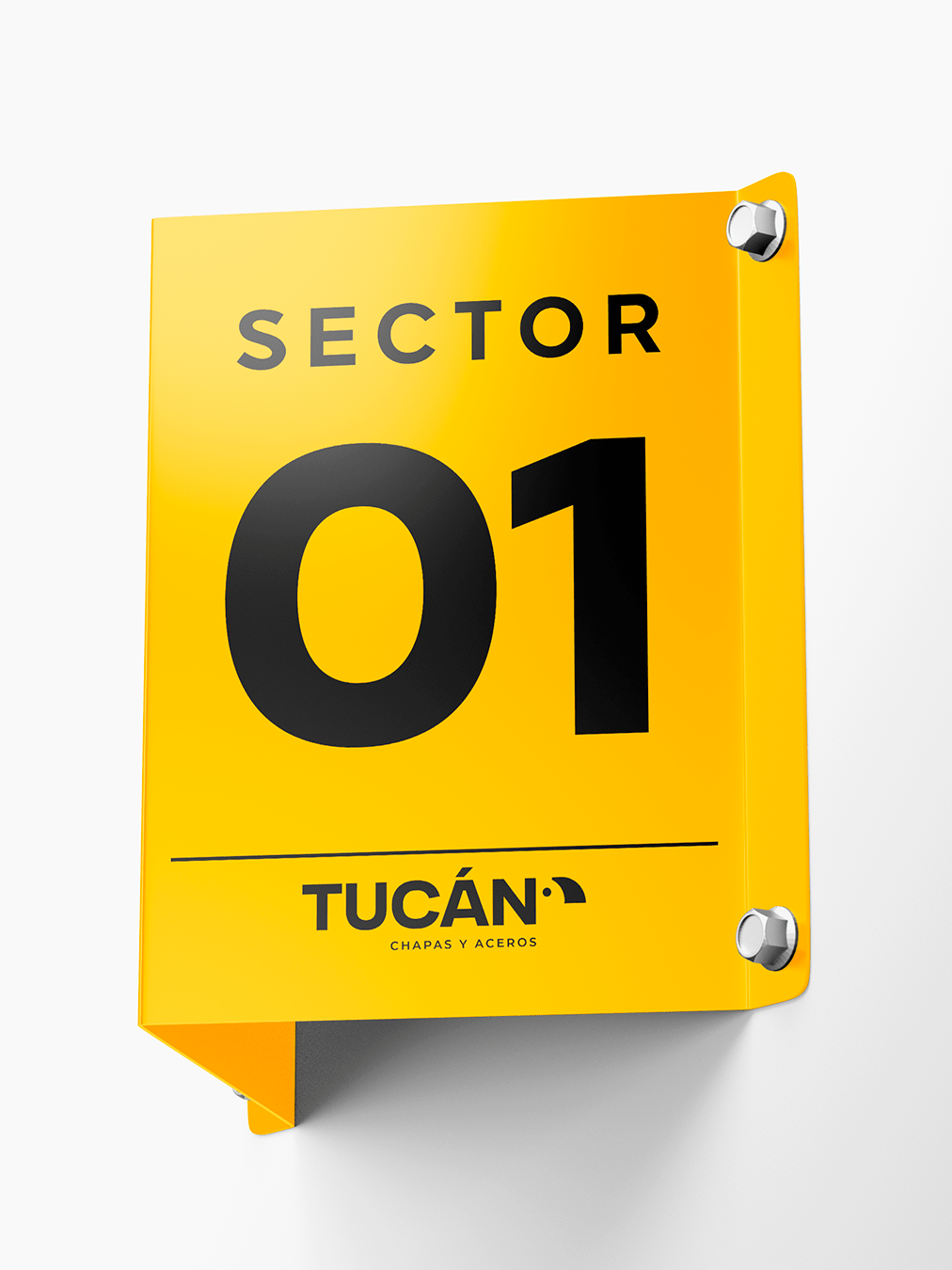
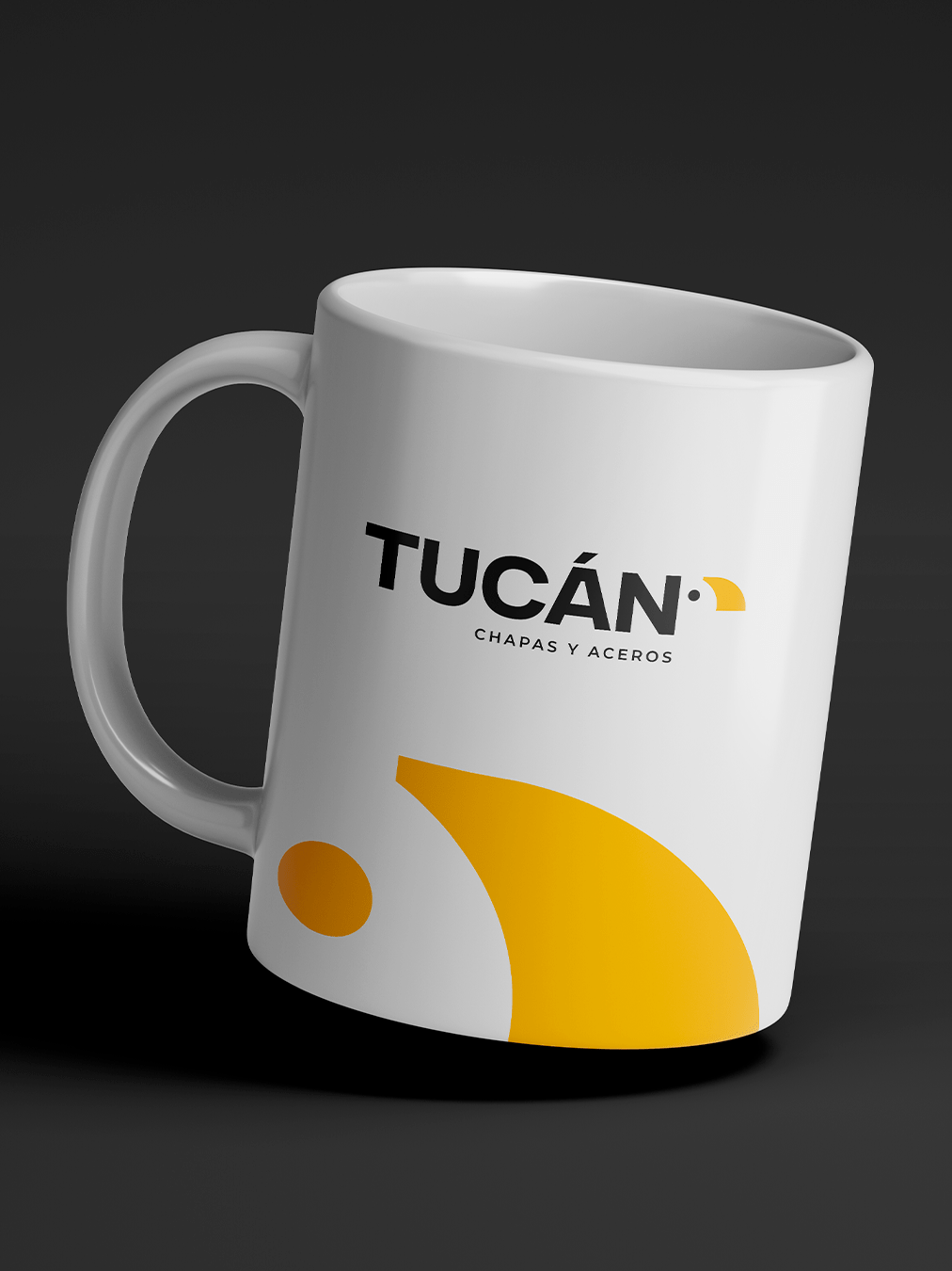
We developed a Brand Audit and Corporate Identity for Tucán Chapas y Aceros, with a strategic approach that balances strength, innovation, and trust. Starting with the name, we created a powerful visual identity, inspired by the abstraction of a toucan’s beak, using shapes and colors that reflect strength and precision.
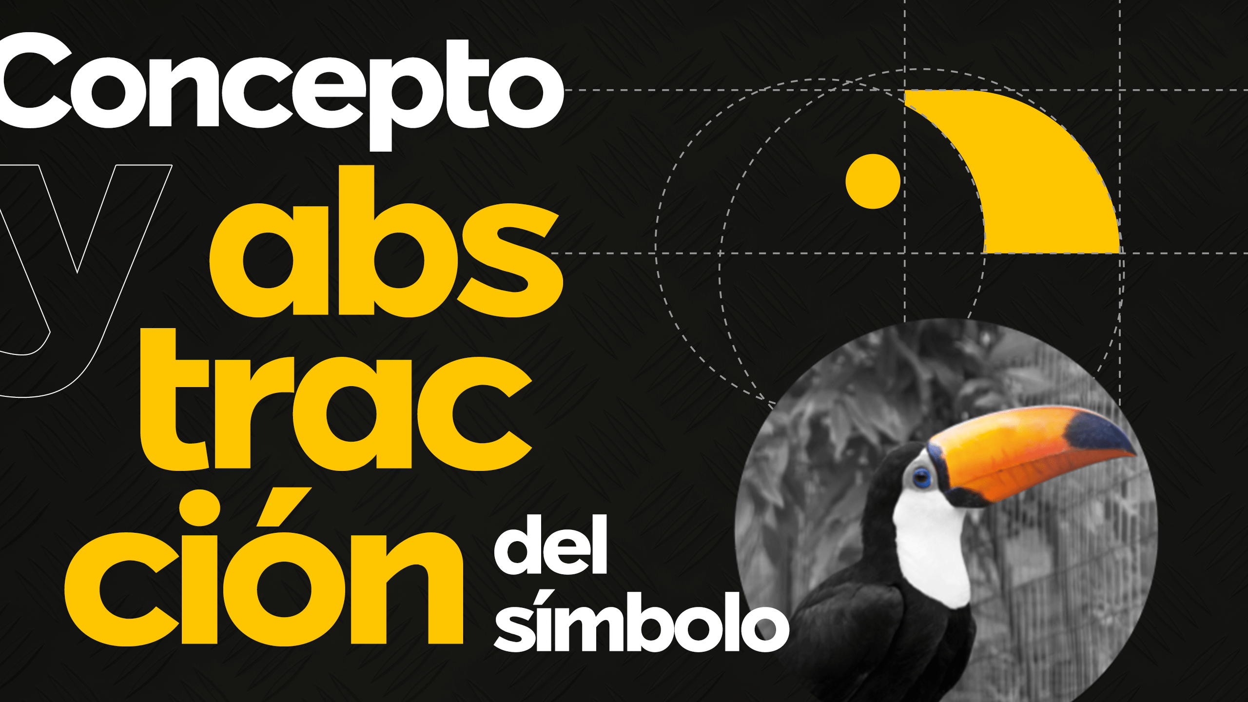
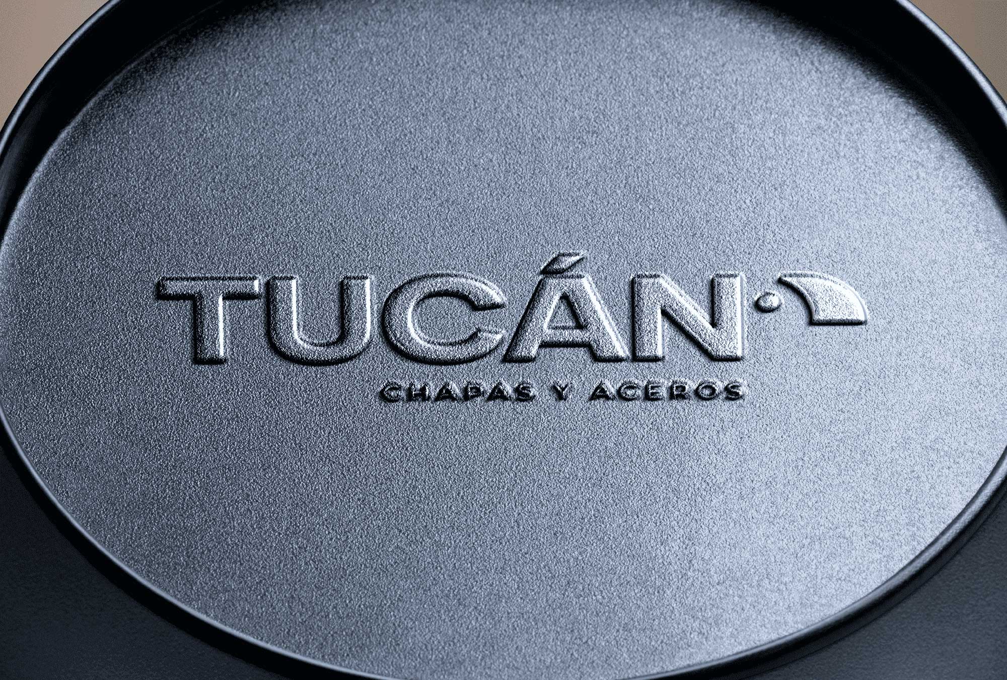
The logo’s symbol design is based on a reinterpretation of the toucan’s beak, not as a literal representation, but as a graphic abstraction. We were inspired by the shapes, curves, and characteristic proportions of this iconic element, synthesizing its essence into a figure that evokes dynamism, identity, and recognition without falling into a direct figurative representation.
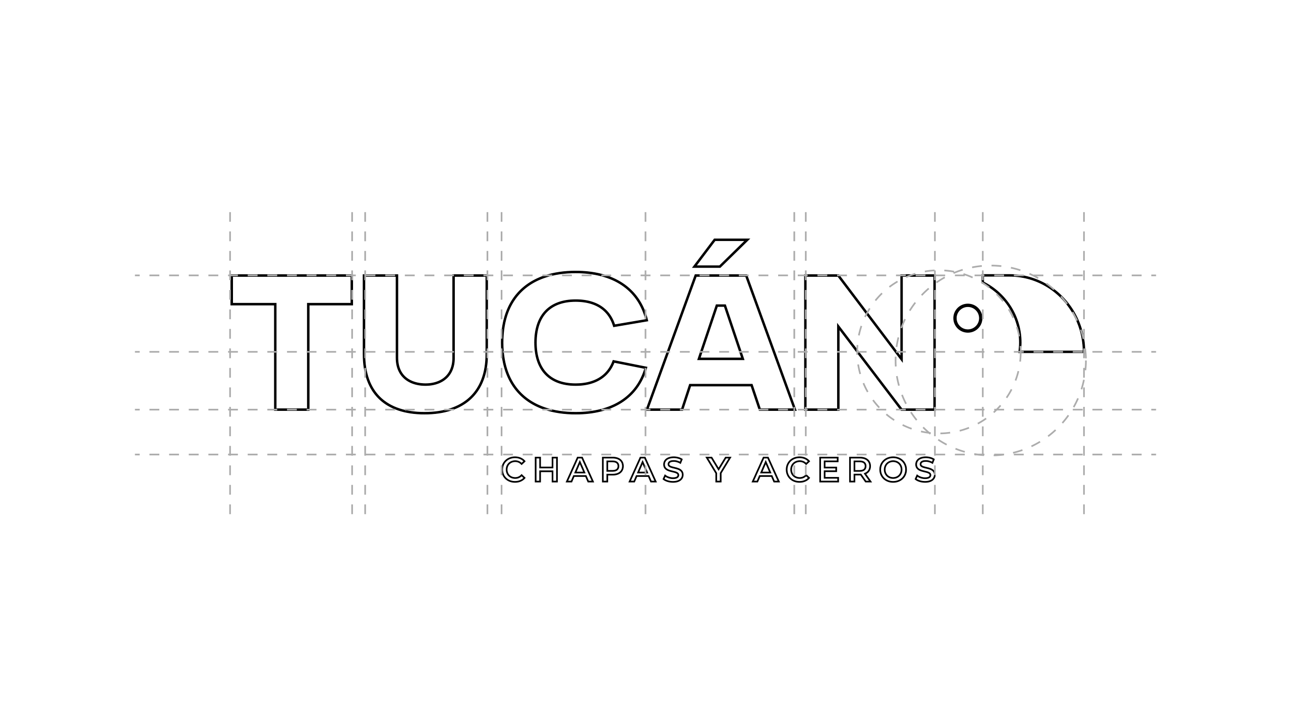
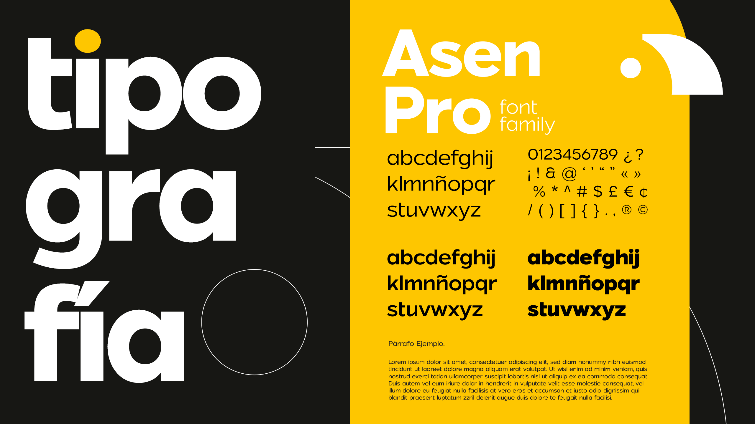
On a formal level, we worked with simplified lines and geometries, allowing the image to work in various sizes and applications without losing its visual strength. This abstraction not only gives the design greater modernity and timelessness, but also allows the logo to adapt to different media and contexts without losing its essence.
The result is a symbol that, although inspired by the shape of the toucan’s beak, transcends its literal representation to become its own distinctive graphic element. In this way, an original and meaningful visual identity is achieved.
The colors used in the symbol reflect the toucan’s distinctive palette, maintaining the visual association with its natural identity. However, they have been strategically applied to enhance the logo’s clarity, versatility, and impact.
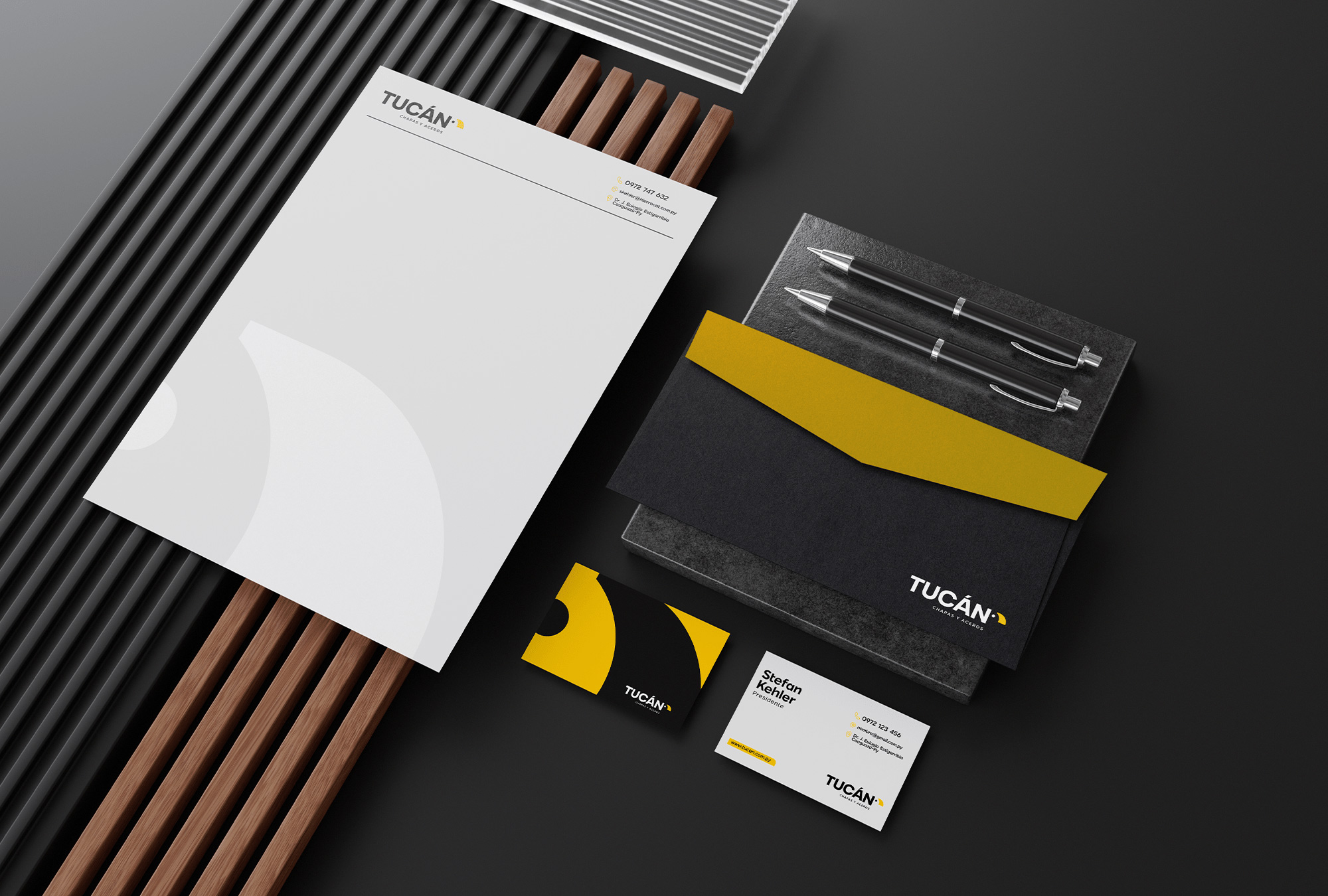
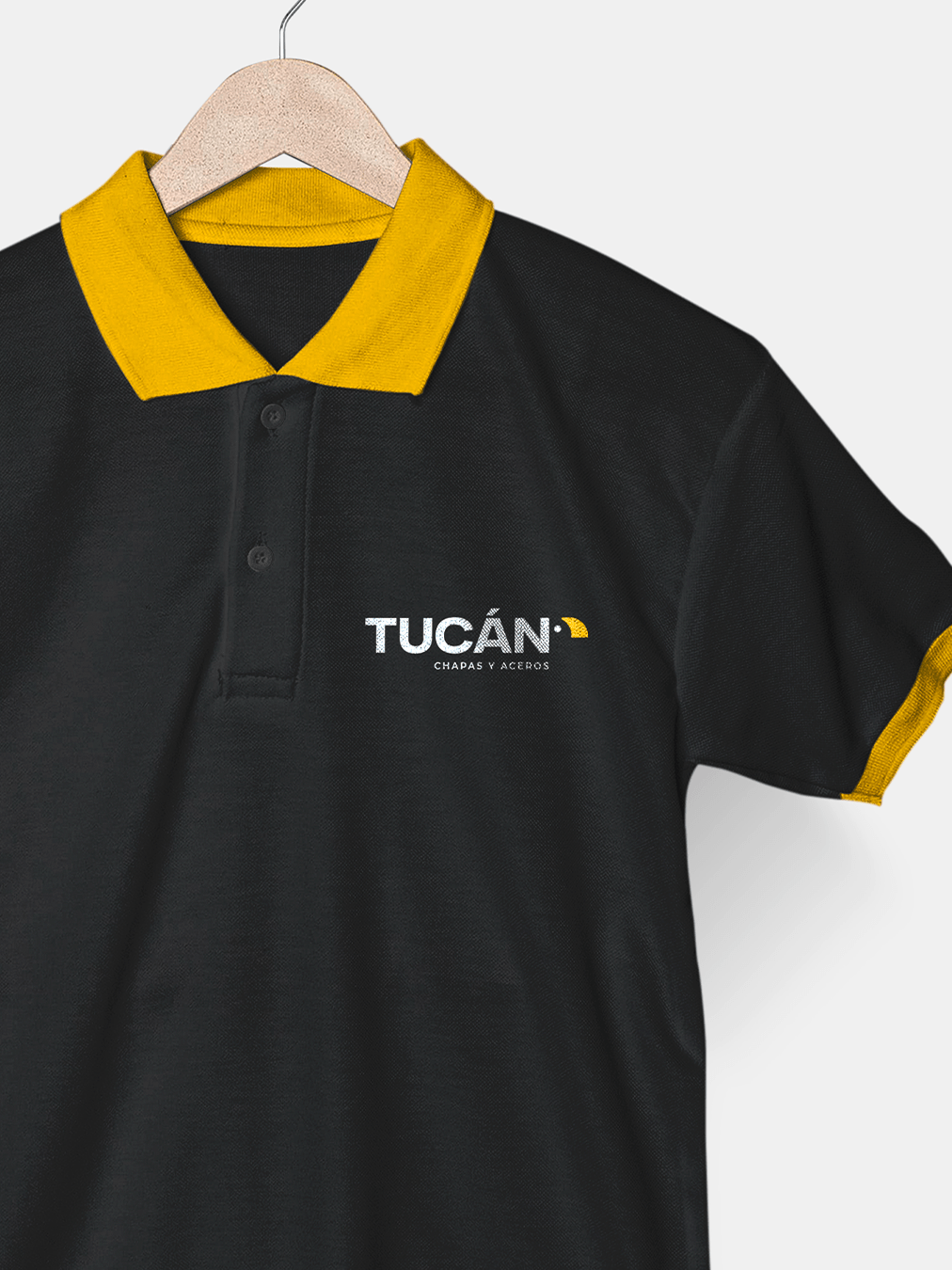
The communication was designed to highlight its leadership in the sector, ensuring consistency across all touchpoints, from its graphic identity to its digital and corporate presence.
You can learn more about Tucán Chapas y Aceros on their website: