A consistent Visual Identity design to communicate a reliable company in the market, with a great growth perspective.
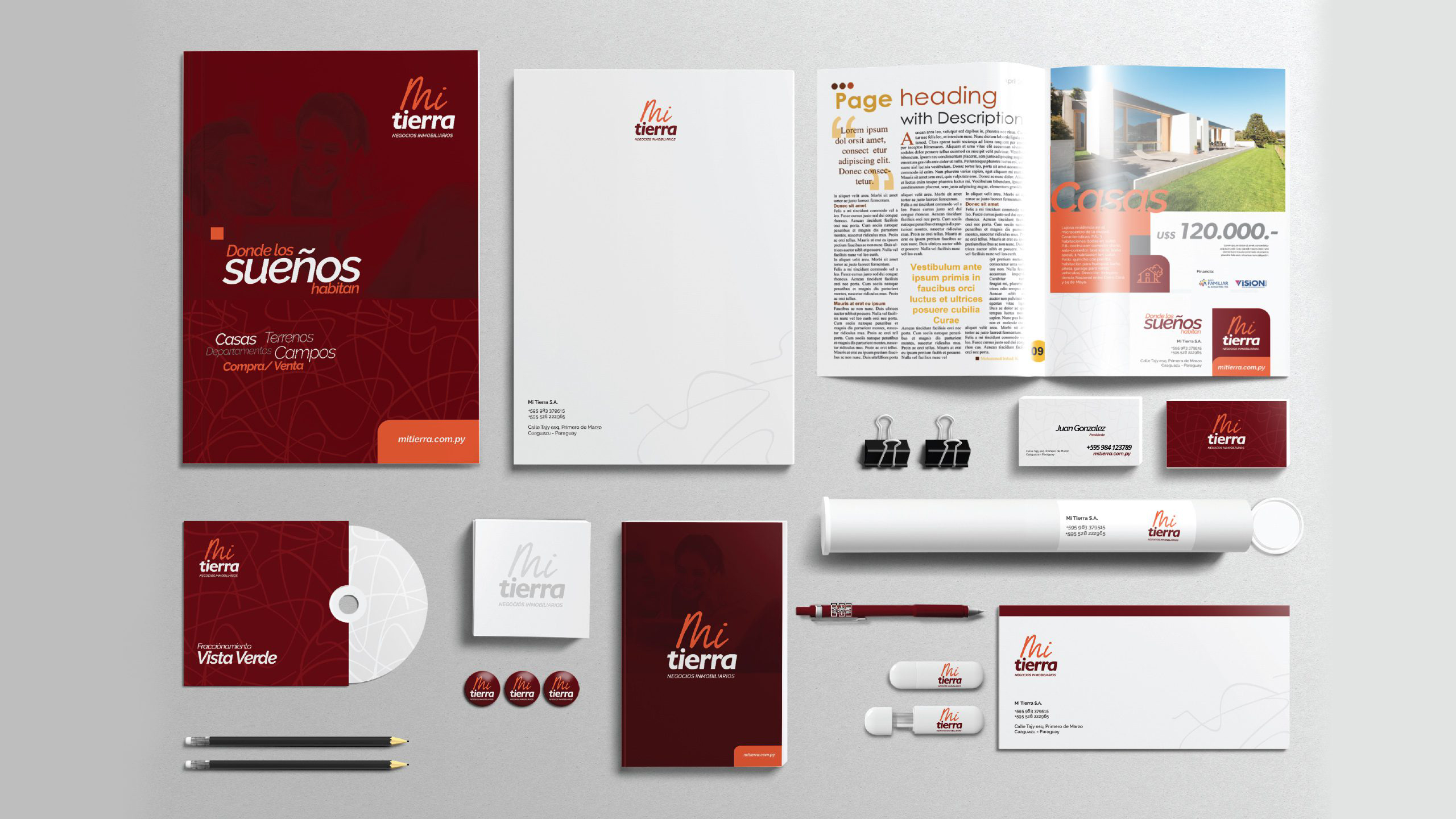
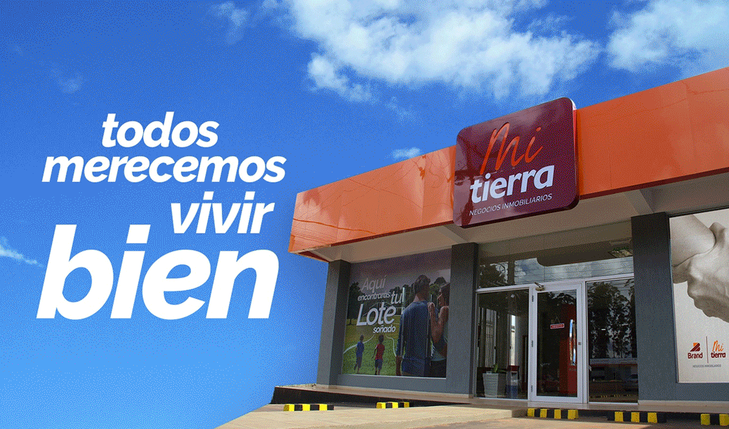
Mi Tierra’s new corporate image combines solidity with empathy. Its logo, composed of a solid typography around the word «tierra» (land), suggests the foundation, the earth, as something firm. It’s also interesting that the typography has irregular endings, just like the earth itself—redundancy aside. The word «mi,» represented in a script typeface—simulating handwritten strokes—expresses proximity to the public, as well as a sense of ownership, as will be expanded upon later in this manual. The color scheme—with colors inspired by the colors of the earth—conveys warmth and closeness. The slogan «where dreams dwell» is aspirational and further reinforces our quest to achieve empathy with the target audience.
We provided strategic advice to the client, starting with consulting meetings that allowed us to understand the company’s philosophy, its growth outlook, and analyze its position relative to its competitors in the sector. With a defined strategy, we were able to develop a communications strategy that led to the new brand, the visual identity, and subsequent support throughout the implementation process (printing of graphic materials, supplier follow-up).
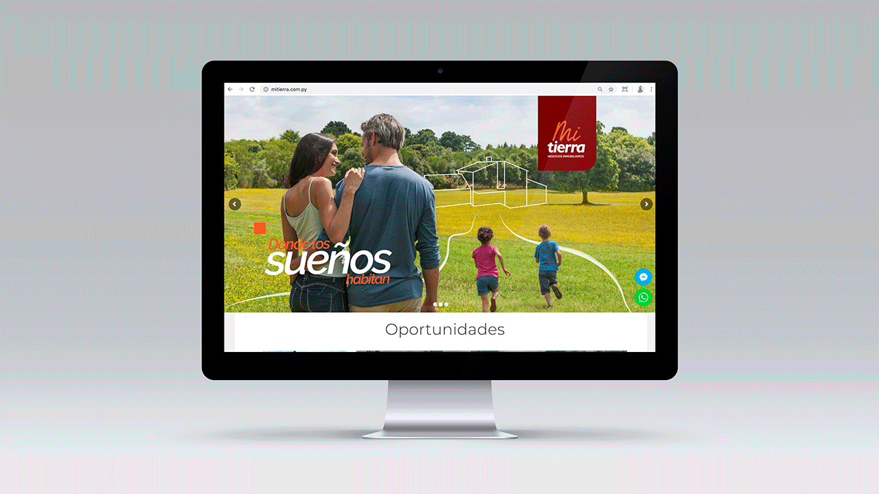
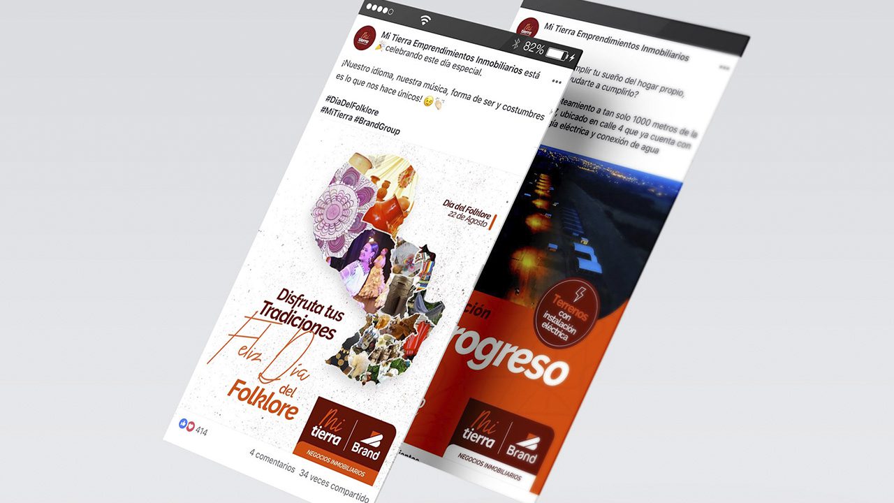
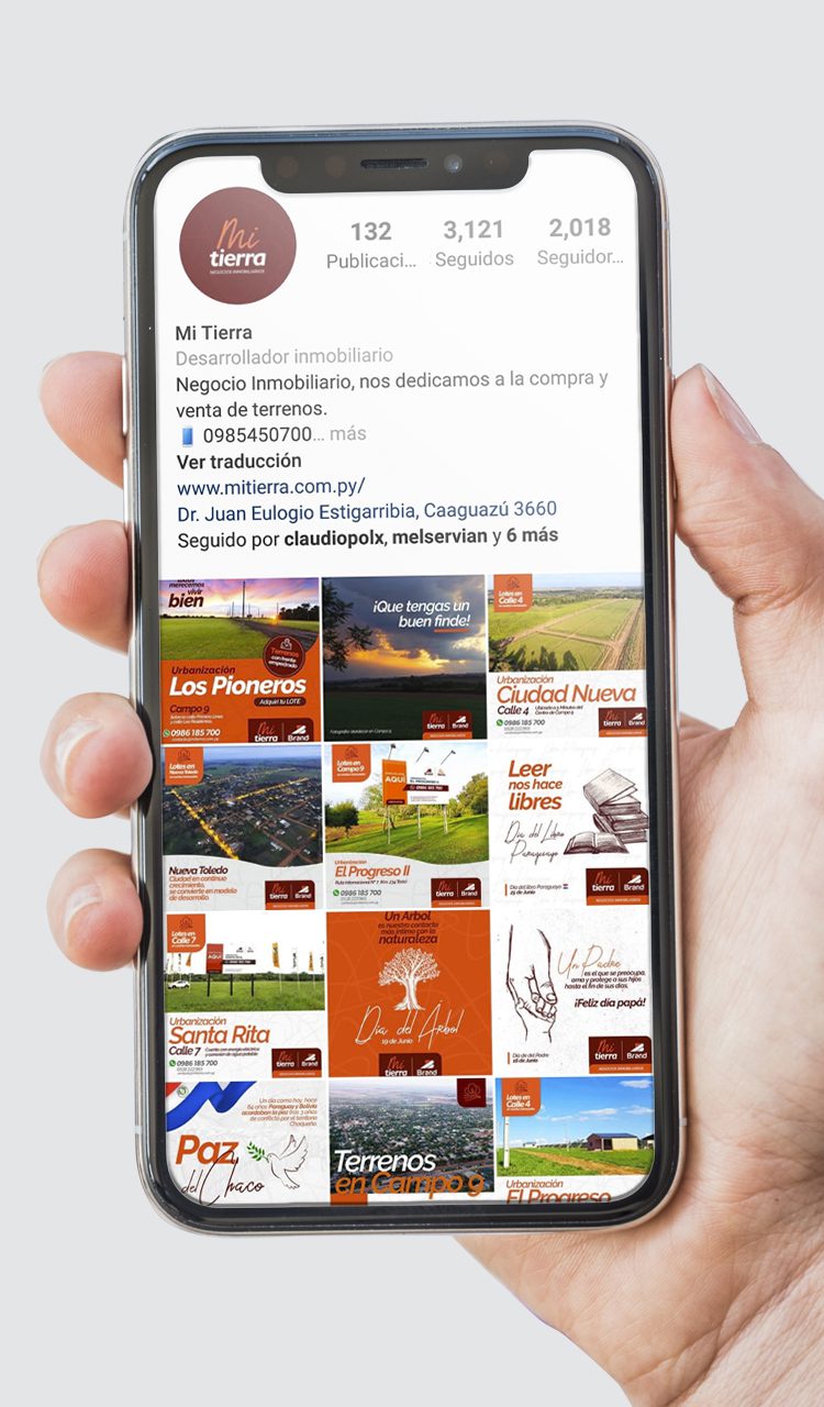
Once the image and communications strategy was developed, we proceeded to implement a digital campaign, which allowed us to publicize the company’s new image.
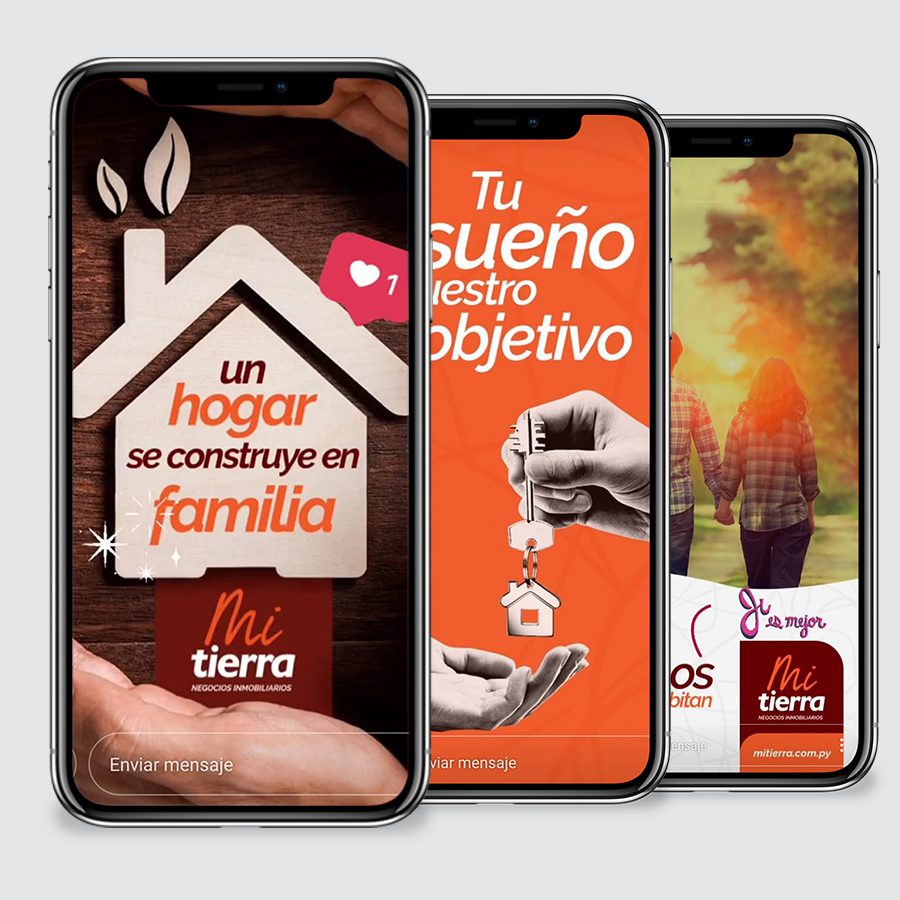
The digital campaign continued with the Digital Management service, which included social media management, content generation, e-flyer design, web content creation for the company blog, and customer conversation monitoring.