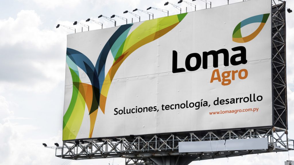
Raising agricultural standards with technology and development.
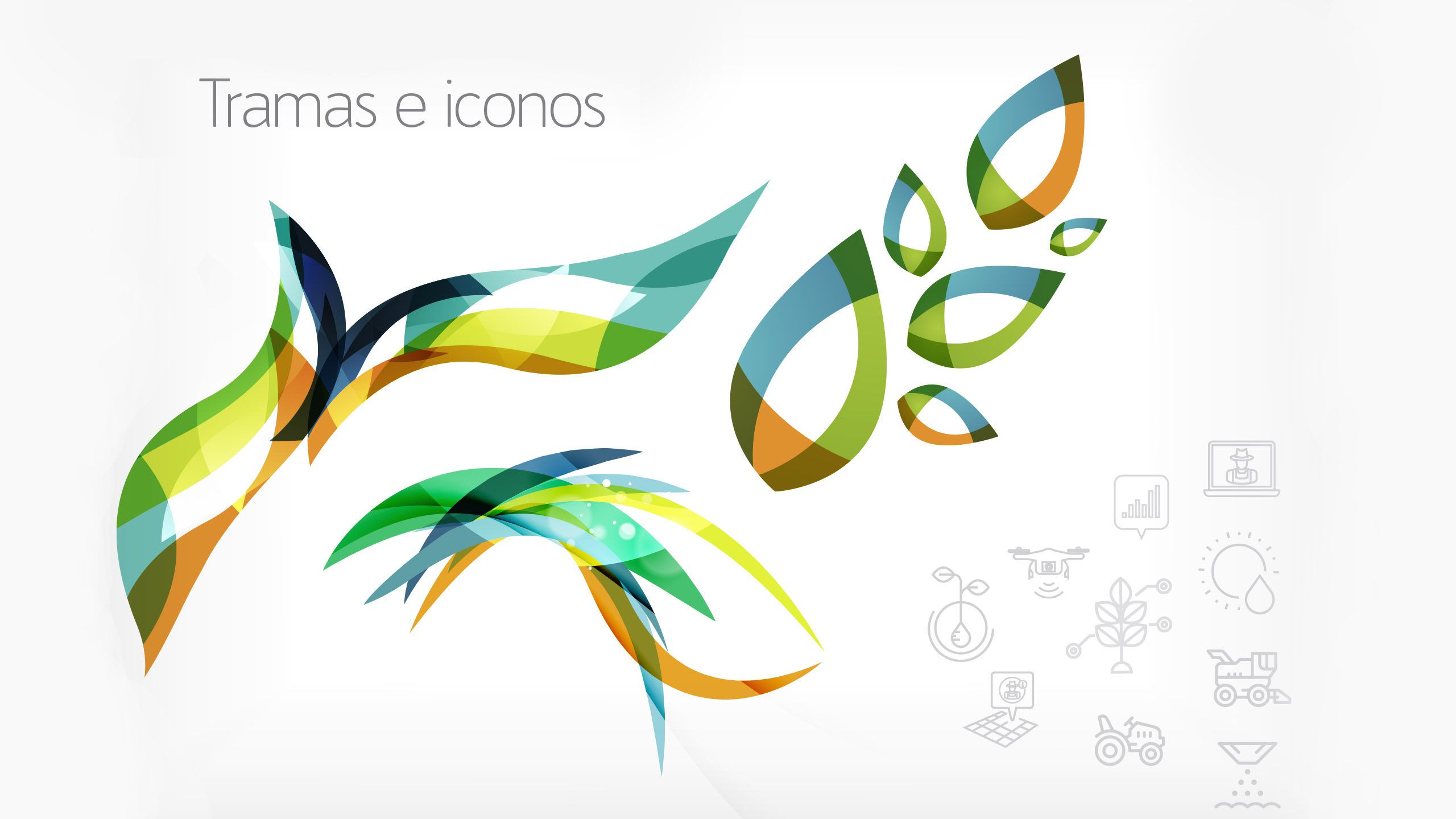
The brand is a logo with an accessory, the accessory is an abstract crop leaf, with a shape that communicates a cycle. It is made up of colors that represent the vital elements of the same, resulting in a cycle of life and continuous growth.
A typeface was chosen for the logo that has a heavy body that conveys security and firmness and at the same time with its rounded vertices it carries with it the concept of the name, as if they were hills.