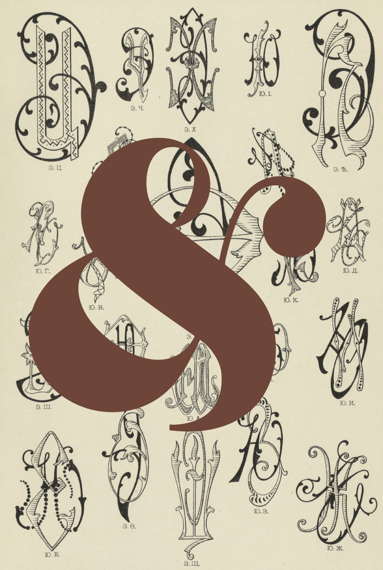
The symbol &, which we know today as the ampersand, has its roots in classical Latin, more precisely in the word “et,” meaning “and.”
During the Roman Empire, scribes and copyists sought ways to write faster and more fluently. A common practice was to create ligatures, that is, to join two letters that appeared together frequently into a single graphic form. This is how the letters “e” and “t” began to visually merge, giving rise to what is now the ampersand symbol.
It wasn’t a decorative invention: it was a practical and elegant solution.
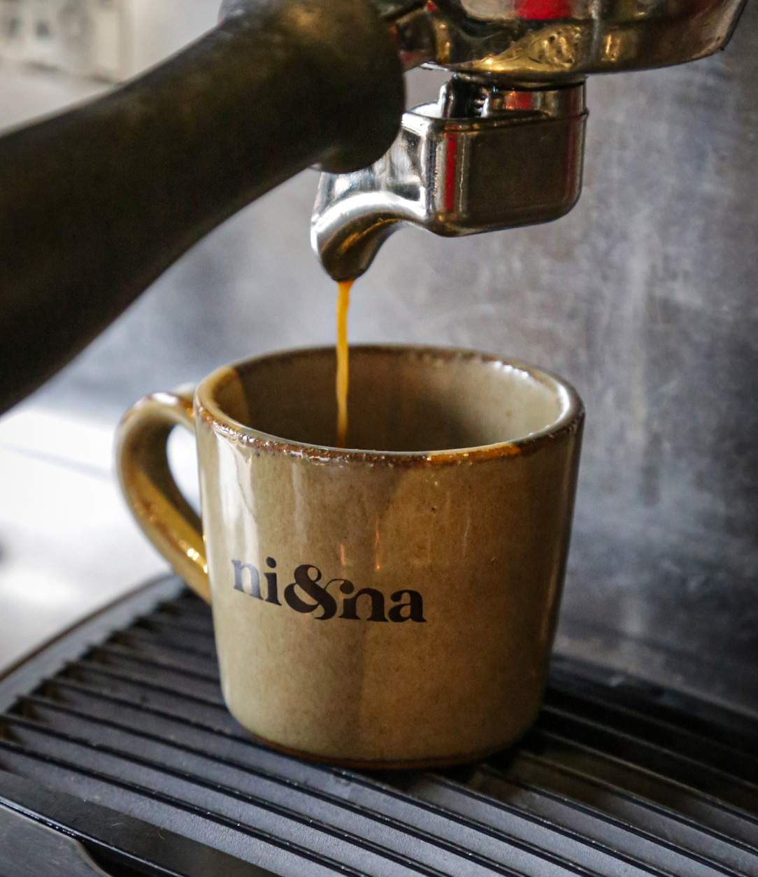
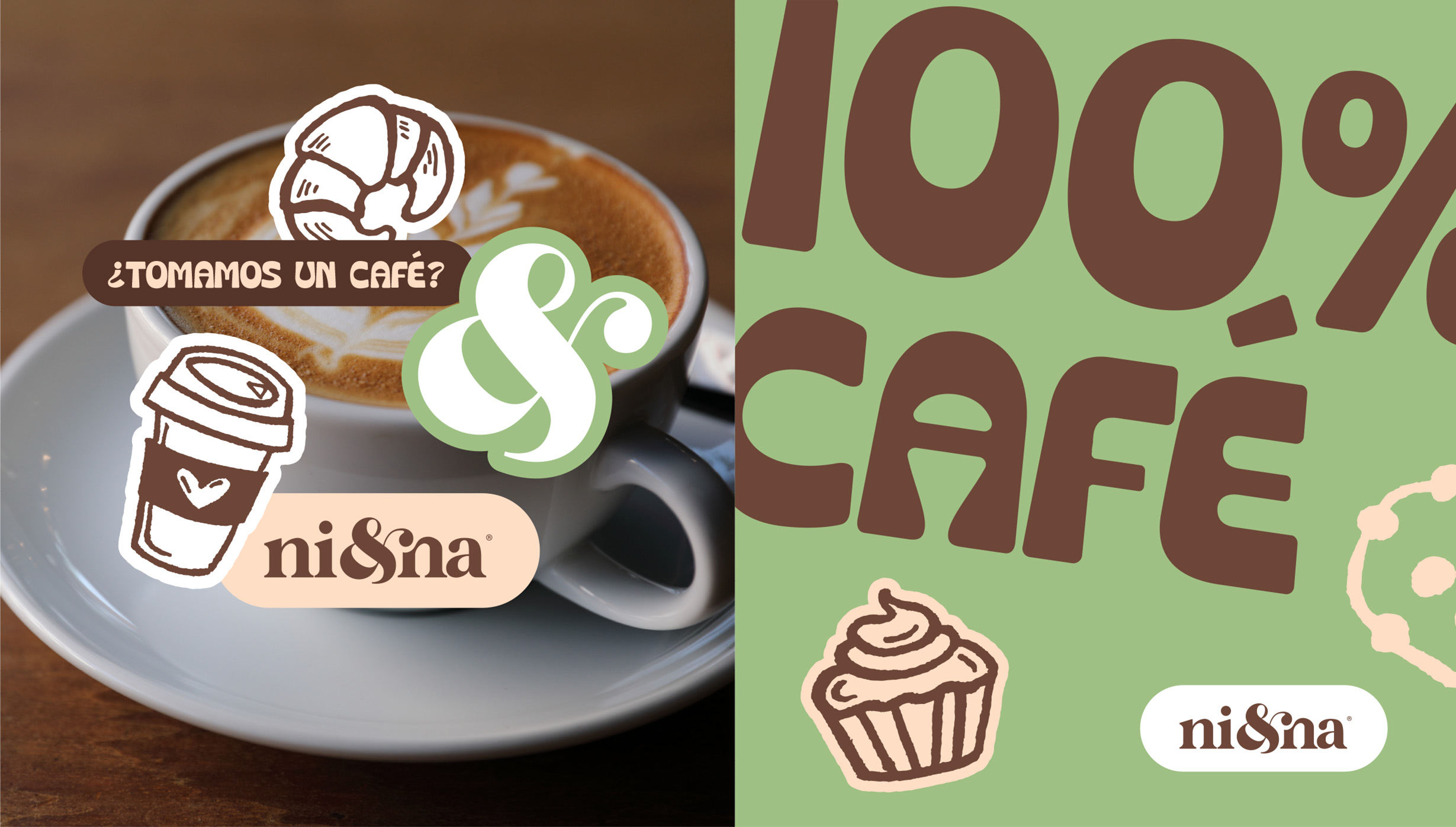
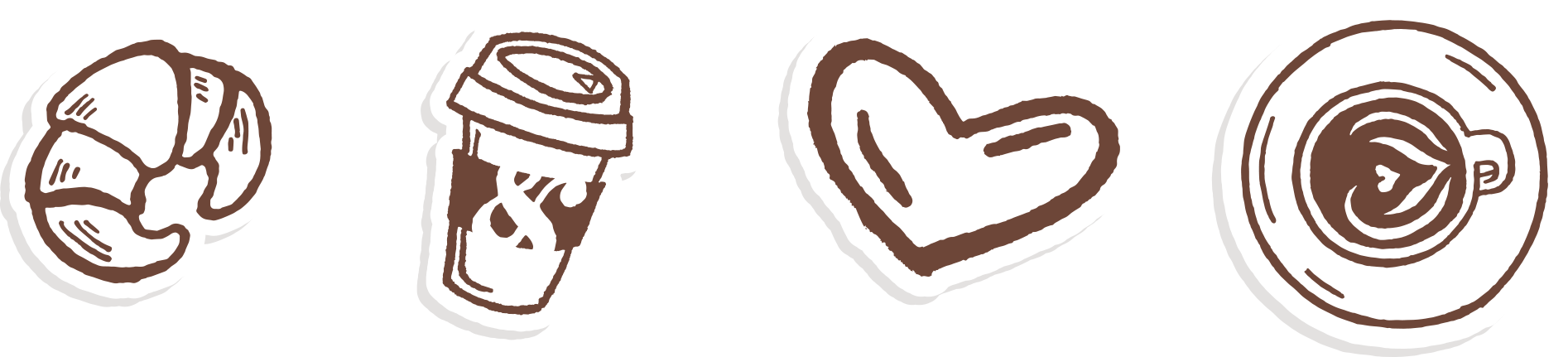
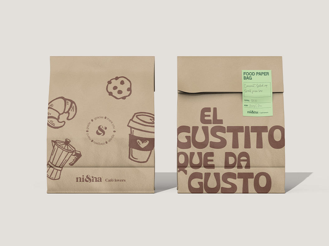
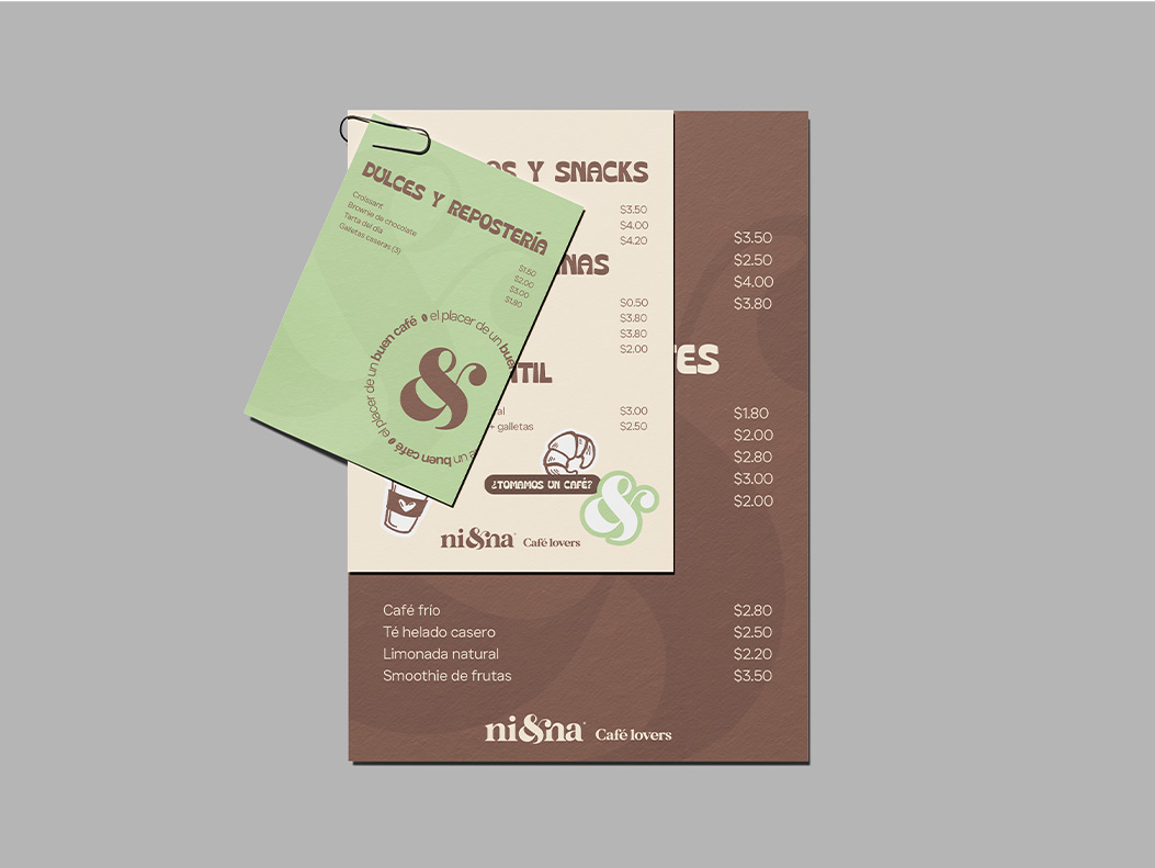
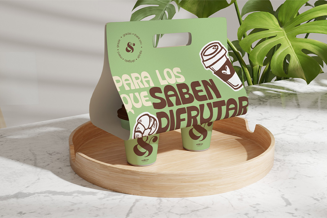
Today, the ampersand (&) is more than just a shortcut. It’s a visually powerful symbol, widely used in graphic design, typography, and branding for its harmonious shape and symbolic value: union.
Some words aren’t invented: they’re born. NI&NA was born from the meeting of two names, yes. But it quickly wanted to be something more. A new word.
A symbol of what happens when we come together.
When you & me.
When your story & mine.
When a coffee & a conversation.
When soul & aroma.
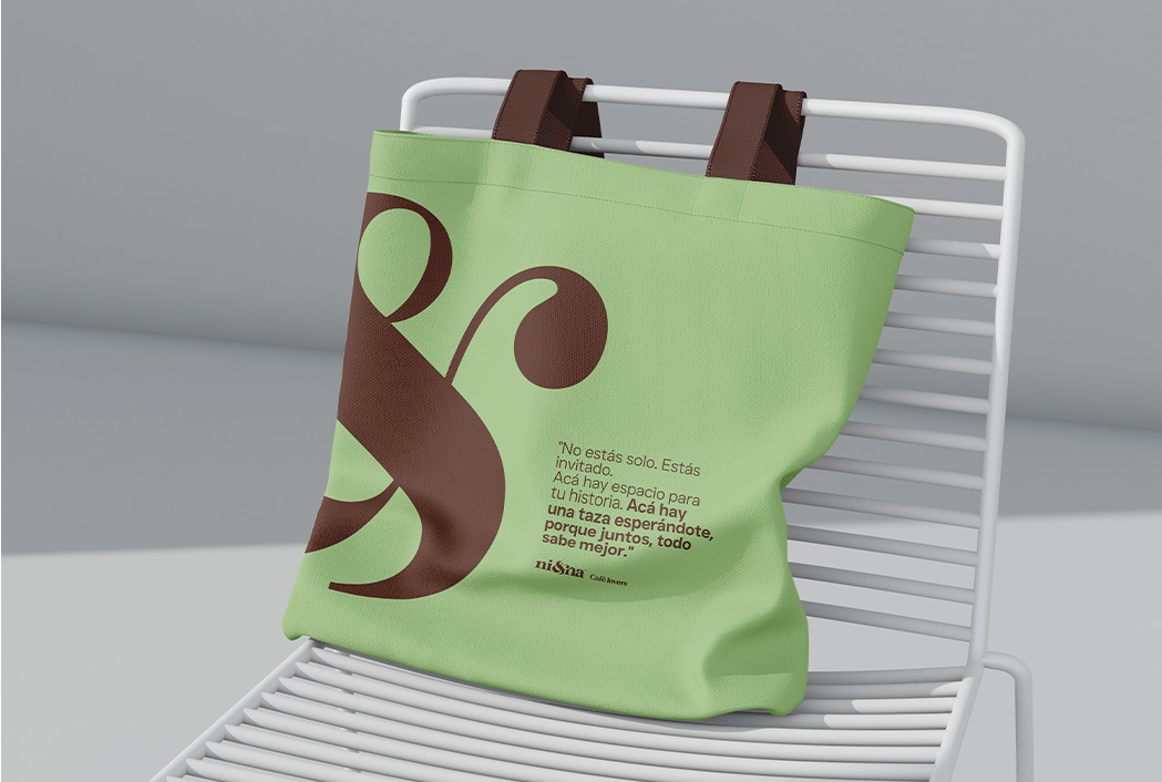
That little symbol between the letters, &, isn’t there for aesthetics. It’s there because it represents something immense: the certainty that life is better shared.
“See, I am doing a new thing! Now it springs up; do you not perceive it?”
— Isaiah 43:19
That’s how we feel about this place: like something new springing from the soul. A rebirth. A space made of grace, flavor, and aromas that awaken what was dormant.

