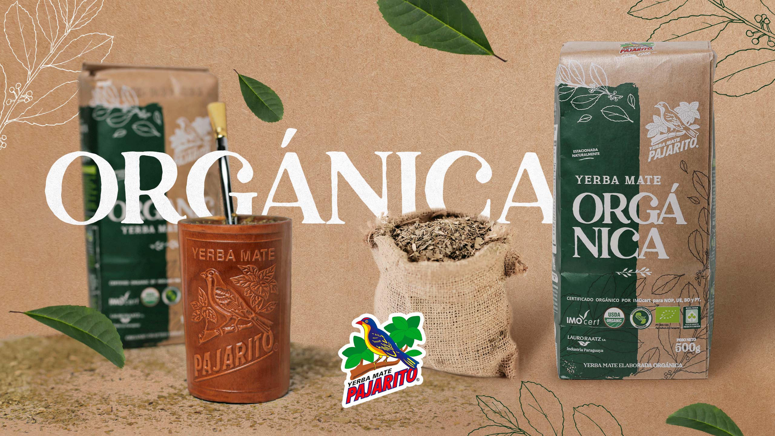
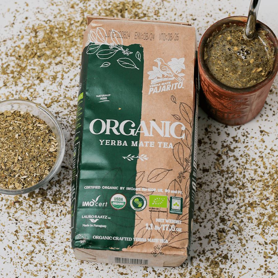
Creation of Packaging for Organic Yerba Mate Pajarito
The packaging design is crucial when choosing a product as it acts as the first impression for the consumer.
Good packaging not only protects the contents, but also communicates brand identity and attracts attention in a saturated market. It can also influence perceptions of quality and value, making customers more inclined to purchase.
In this case, we had the challenge of communicating the characteristics of Pajarito Organic Yerba Mate, and to do so, we used features such as:
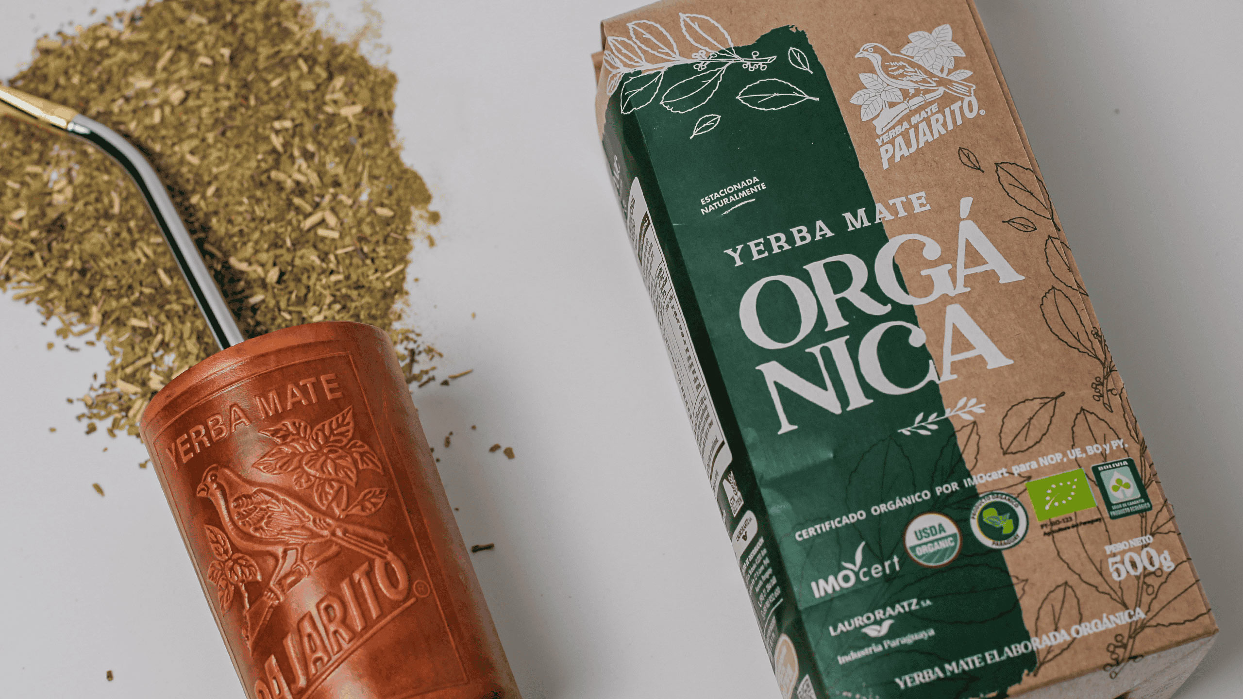
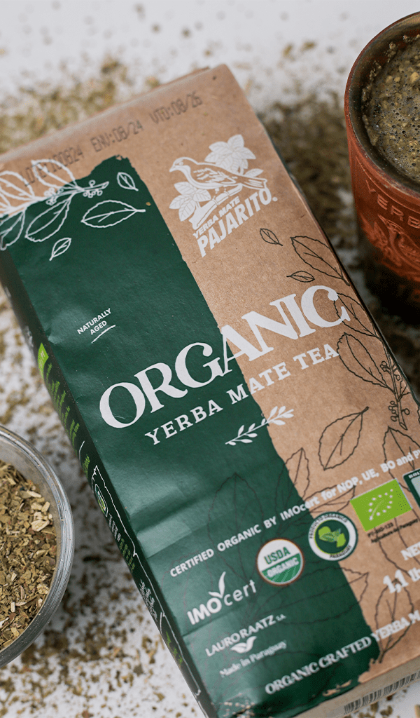
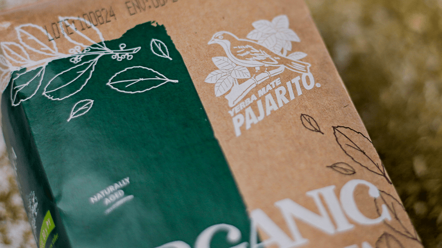
Natural Colors: We used green, brown, and terracotta tones, which evoke nature and freshness. These colors are associated with agriculture and sustainability.
Textures and Materials: We opted for materials that reinforce the organic message, such as kraft paper, which can create an authentic and natural feel.
Images and Graphics: We incorporated illustrations of plants and natural elements, and patterns inspired by yerba mate that give it a magical touch.
Typography: We used fonts that convey a rustic or artisanal style and highlight the authenticity of the product. Essentially, we paid special attention to the typography.
By combining these elements, Pajarito Organic Yerba Mate’s packaging can effectively communicate that it is an organic product, aligning with the values of consumers interested in healthy and sustainable options.
Packaging design has the power to attract consumers and reinforce brand identity.
At esencia, we carry out planning, design, feasibility analysis, and product positioning strategies.
An investment in good design can have a significant impact on sales and on consumers’ relationship with the brand.